
Data visualization is the graphical representation of information and data. By using visual elements like charts, graphs, and maps, data visualization tools provide an accessible way to see and understand trends, outliers, and patterns in data.
In the world of Big Data, data visualization tools and technologies are essential to analyze massive amounts of information and make data-driven decisions.
Examples of data visualization
Data visualization tools can be used in a variety of ways. Many business departments implement data visualization software to track their own initiatives. For example, a marketing team might implement the software to monitor the performance of an email campaign, tracking metrics like open rate, click-through rate, and conversion rate.
Advantages or benefits of good data visualization
1. Faster Action
The human brain tends to process visual information far more easily than written information. Use of a chart or graph to summarize complex data ensures faster comprehension of relationships than cluttered reports or spreadsheets.
2. Communicate Findings in Constructive Ways

Many business reports submitted to senior management are formalized documents that are often inflated with static tables and a variety of chart types, which fail to make information memorable. But with the help of data visualization it is possible to encapsulate complex information on operational and market conditions in a brief series or even single graphic.
3. Embrace Emerging Trends

By using big data visualization for monitoring key indicators, business leaders can more easily spot market shifts and trends in varied and large data sets.For instance, a clothing chain may see that in the Southwest, sales of darker suits and narrower ties are on the rise. This may allow them to promote clothing packages including both, or a new line of narrow ties well ahead of rivals who haven’t noticed the trend yet.
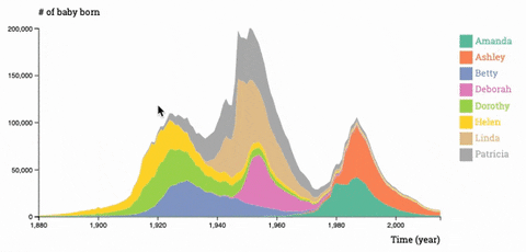
4. Create New Discussion

One advantage to big data visualization is that it provides a ready means to tell stories from the data. Heat maps can show the development of product performance over time in multiple geographic areas, making it easier to see those that are performing very well or under performing. This allows executives to drill down into specific locations to see what’s being done well or poorly.
Why data visualization is important for any career?
It’s hard to think of a professional industry that doesn’t benefit from making data more understandable. Every STEM field benefits from understanding data—and so do fields in government, finance, marketing, history, consumer goods, service industries, education, sports, and so on.
The concept of the citizen data scientist is on the rise. Skill sets are changing to accommodate a data-driven world. It is increasingly valuable for professionals to be able to use data to make decisions and use visuals to tell stories of when data informs to who, what, when, where, and how.
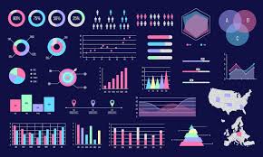
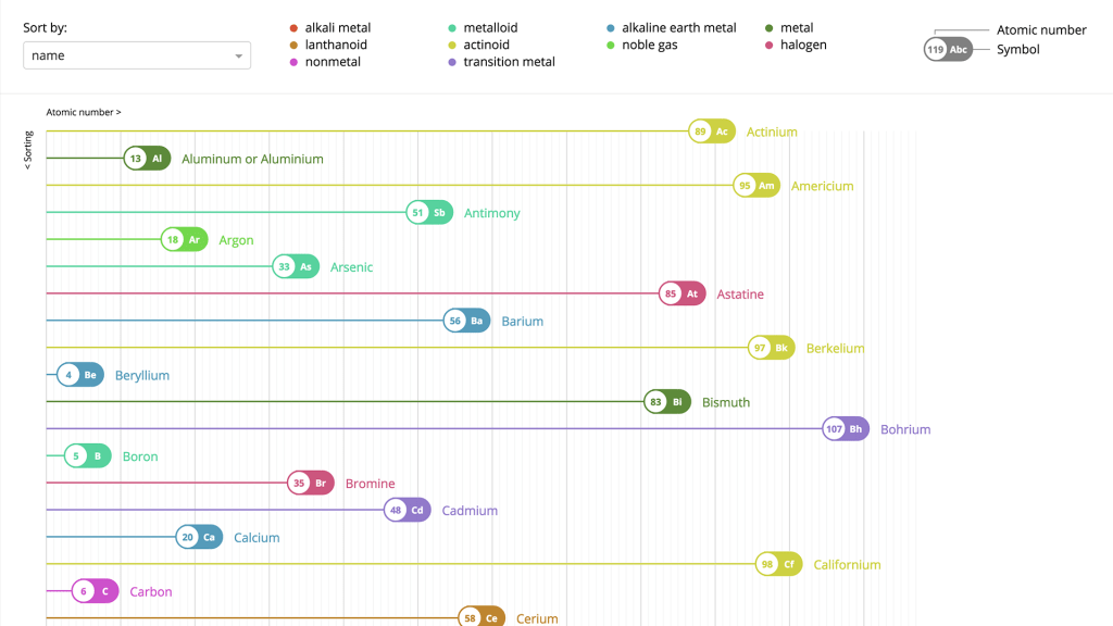
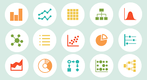
Different types of visualizations
When you think of data visualization, your first thought probably immediately goes to simple bar graphs or pie charts. While these may be an integral part of visualizing data and a common baseline for many data graphics, the right visualization must be paired with the right set of information.
Common general types of data visualization:
- Charts
2. Tables
3. Graphs
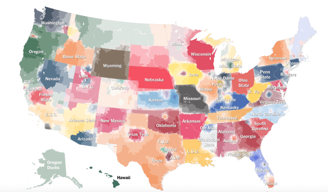
4. Map
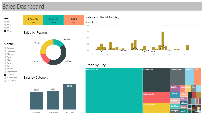
5. Dashboards
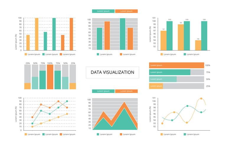
More specific examples of methods to visualize data:
- Area Chart
- Bar Chart
- Bubble Cloud
- Bullet Graph
- Cartogram
Best Data Visualization Tools
Tableau- Tableau is often regarded as the grand master of data visualization software and for good reason.
Qlikview- Qlik with their Qlikview tool is the other major player in this space and Tableau’s biggest competitor.
Fusion charts- This is a very widely-used, JavaScript-based charting and visualization package that has established itself as one of the leaders in the paid-for market.
Datawrapper- Datawrapper is increasingly becoming a popular choice, particularly among media organizations which frequently use it to create charts and present statistics.
